-
taking flight!

-
This post has been liked by:
-
I already started working on the vulpix do ill claim it. be up soon!
-
-
Virbank Gym Leader

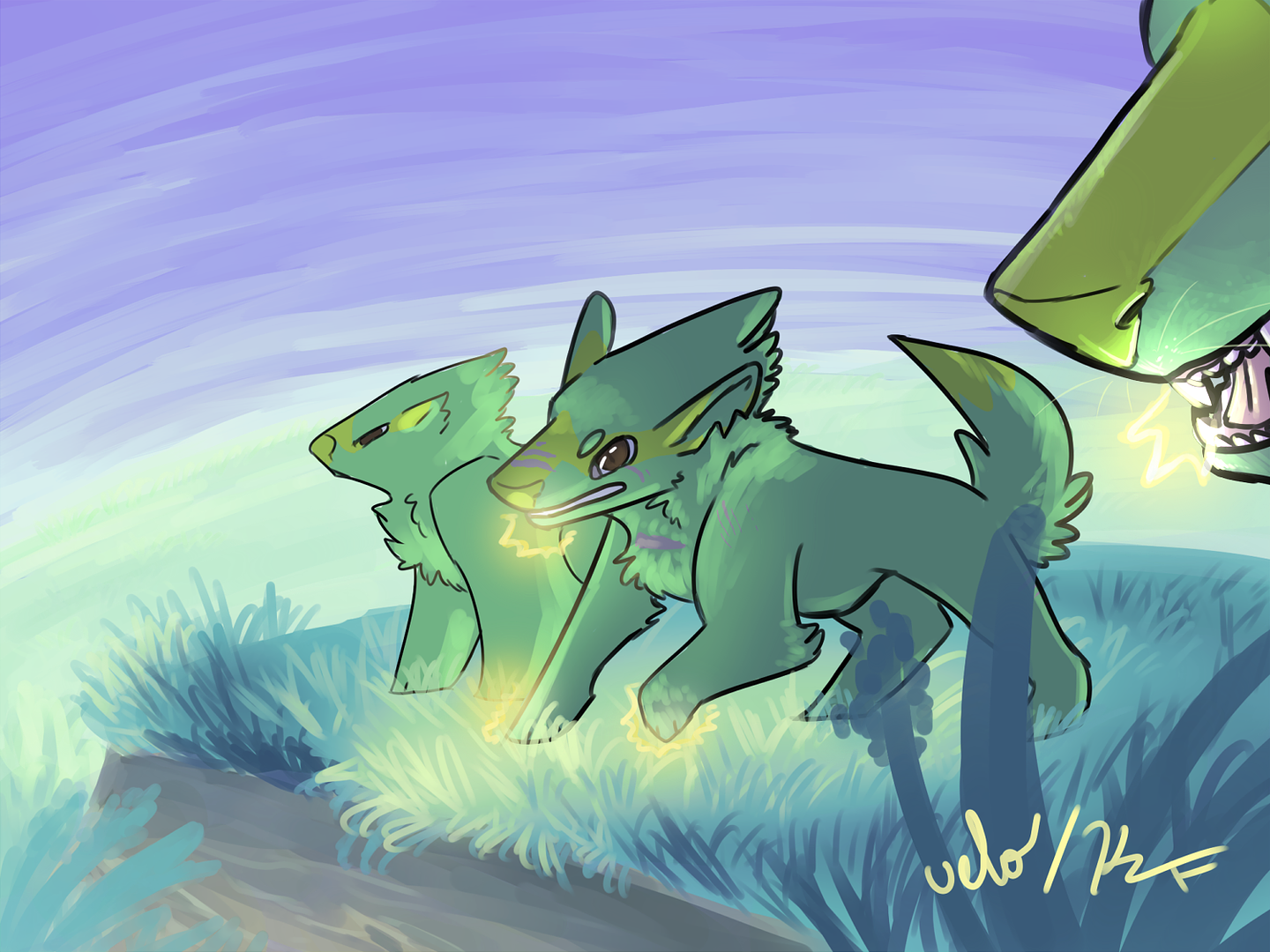
I'm claiming Lightning Queen.
-
-
Virbank Gym Leader
Lightning Queen curation.
@Velocity; Sorry you had to wait so long. I meant to post this yesterday too, but we lost power and it took them a long time to repair the transformer that broke down the street.
Form
I definitely like the dog-like style you applied to the Electrike, particularly around the ears. Your version make them seem like actual ears and not corn cobs or something. I think the fur tufts are well-done too, which works for the theme while keep the basic, recognizable form of the Pokemon intact.
The scars/marks on the middle Electrike are also a nice touch. They add to the story element. That’s one thing that I greatly appreciate in any artwork, since there’s a lot more feeling to pieces with a tale behind them. Nuzlocke art is among my favorite as well. From the way you distinguished this Electrike in the middle, it definitely gives off a leader vibe, which is what you imagined your mon to be. This effect is also helped by making this Electrike the only one the viewers see the majority off as the focal point.
I think you could’ve gone even further with the fur aspect too. The tufts on the head, tail, and shoulders are great, but a lot of the body feels a little flat and un-textured in comparison. I like what you did at the mon’s elbows specifically. That same effect could’ve maybe been also added at the juncture of the leg to the body, or even in tufts on the back, as a dog’s fur is rarely so sleek in one place but not others. The wofly adaptation worked pretty well, so it wouldn’t hurt to really sell the concept and create that fur look on other parts of the body (again looking mostly at the end half).
I think the same could be said for the Electrike in back too. That one’s not as important, but stylistically it looks a bit different from Spark, particularly around the head and front foot, because the amount of detail in both figures isn’t the same. That’s not a super bad thing, since that’s a great way for the artist to create focus, but it does make the other ‘trike’s mouth and feet look strange. In Spark, the mouth indent comes all the way to her eyes, while in the other one it’s not visible at all. The same goes for the feet—while Spark’s are more rounded and paw-like, the other Electrike’s look like blocks. The nose-shot we get up close is also very detailed, so the third one just looks off.
Again, this is fine, and in general I have no big complaints about form, but just be careful how much attention you give one area of the piece compared to the others. It’s a very fine line sometimes.
Technique
Another thing that might help give a little dimension and decrease flatness in Spark is adding some more layers of shadows. It’s great that you’ve put in a layer of them already. It definitely gives the objects some volume. However, on all the mons, it’s only one layer, so that’s a good opportunity to crank up the detail. Particularly I’m thinking areas like underneath Spark and her hind leg—in theory these areas should be darker than the far side of the body, since less light hits underneath. From what I can tell, the setting (or rising) sun (which is not even really very bright at all) and the electricity in their mouths are the only sources of light. More shadows in the tail or at the juncture of limbs could also go hand in hand with more fur as well.
Some of your light/shadow placements are also a little confusing. The big one is for the close up shot of the Electrike on the far right. I like that you played around with perspective here and put this one really close so we could get an eyeful. However, because you have a shine on the back of Spark’s tail, it sort of looks like there’s a giant dog right behind her about to eat her, since there’s no real logical place for that light beam to come from otherwise. The sun isn’t bright enough to cause a super shine.
The same thing goes for the far Electrike. Because Spark has electricity in her mouth, the shoulder closest to her should also be bright, not its chest, which is obscured a little by the leg (especially since the far Electrike doesn’t have electricity). These two should be flip-flopped. There is a little bit of a curve to the far Electrike’s leg (which would warrant some shadow), but I don’t feel it’s as much shadow as you included. That would make its leg super huge and disproportionate.
I do like that the image isn’t exactly center, though. Interesting parts of a piece or film are usually on the 1/3 lines (like if you cut the picture up into three pieces both horizontally and vertically), and you do that by having some open space as well.
I guess the only thing off is that the work seems a little heavy on the right side, like if I pinned it up to the wall, it would lean that way. Clipping some of the canvas could help restore balance, as well as maybe moving the really close Electrike down a little bit, so it looks more like it’s in front of Spark and not behind her.
Background
The style of the background is very soothing and nice. I see you played around with opacity, and everything has a bit of a soft look, even the sky. While that follows the same theme, it probably could’ve been blended/smudged a little more. It’s sort of obvious that there’s streaks of colors dashed across it. That sort of look works for the cliff, since stones aren’t cut smoothly all the time and rocks tend to have lines of different colors through them, but the sky is a little different when it’s not cloudy.
The softness background does serve at making the main focus, the Electrike, pop out too, since nothing in the background has the black outline like the Pokemon do. However, I also feel that because the outlines are so dark and crisp, it makes them look a little out of place. If the outlines were thinner or more feathered, such as the lines on the close-up Electrike’s nose, I think that would’ve been a little more conspicuous and given the mons the same soft feel as the background. They still would’ve popped a little, since the outline would be there, just toned down a little. You could even play with the opacity of those lines too, like you did with the grasses.
Again, a big portion of the sky doesn’t really seem necessary, so clipping a little of the canvas might also help here too. You wouldn’t have to smooth/add to the background so much, and balance could be helped out. Overall, I really like the effect of the non-outlined material—the Pokemon just kind of jolt me as a viewer out of that.
Result
I really like this piece. I like the mixing of the two styles, with the non-outline background and the standard outline of the mons as in the anime. Some of the shadow/light bits were confusing, but I like that you stylized it and gave it a story. A job very well-done. I’m scoring this a 45/45, so that means Electrike is captured!
If anything I said was confusing/misread, be sure to let me know!
-
-
Stuck.

I'm going to go ahead and post a critique for the first Vulpix before too long. I'll give you a mention when I get it up, Velo!
-------------------------------
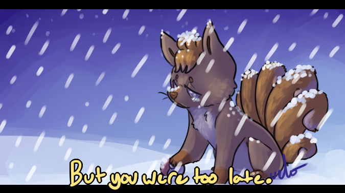
"Goodbye"
Upon looking at this, I am really curious as to what the story is behind it.
Effort and Detail
Can I just mention how I love the little clumps of snow that have collected on Vulpix's tail and head? This the sort of detail that a lot of artists overlook, but clearly something you did not. And while it's a little faint, I love the subtle strokes of "fur" on its tails and especially its cheek.
It looks as if it's snowing...well, rather hard at that, and I know that's the kind of portrayal you were going for by making those streaks of snow. It's snowing relatively hard and the wind is blowing briskly, too. However, due to how long your strokes are I really can't help but notice they look more like white, fluffy drops of rain than snow. This is really just a nitpick, however.
Color, Shading, and Texture
I ALSO want to tell you how I love your use of hue. Vulpix's colors are slightly drowned out, which is perfect for the mood that is being created. I also love how you slowly shift your warm hues to a more blue / violet color, here. Shifting over to cooler, duller colors once again heightens the mood this is trying to portray: one of sadness and regret, if not guilt.
I feel as if you could have more contrast overall, specifically with Vulpix's brown fur. The little strokes by its muzzle / cheek you added are actually so subtle that it takes a couple of seconds longer than it should to notice.
I understand this to be a kind of speedpaint, so the background wasn't really emphasized too much. In some cases this would be detrimental, but in a way it's beneficial here, because it once again adds to the mood. It's barren, empty, lonely, and cold. There's no one else in sight; nothing else but the vast landscape of snow. It's a sad, secluded place. The slightly dulled colors you use for the background even make it seem as if it's a bit foggy or blurry to see very far; fog represents uncertainty and even confusion. There's just so many things I could point out about this, but we can save that for another day!
Creativity / Effect
I know there is some story behind this. SOME story, but I'm not sure what it is and now I'd kinda like to know. You hook the viewers in with this clear allusion to something deeper, but you don't give very much context as to what's going on. Some extra, added details like a faded painting in the background of a mugshot of a character (commonly used when a character is reflecting back on another character; namely with loss and death, in this case). That way, it would get the viewers to think a little more and help them see into your "world" better. The text at the bottom adds ambiguity to the story; and don't get me wrong, a little bit of ambiguity is good. You don't want to be too straight-forward or else you're basically handing all of the information out to the viewers on a silver platter, which I'm assuming was not what you were going for.
What I'm saying is that while I like the ambiguity of the piece, it may be just a little too ambiguous as to the story behind the painting. There's definitely something deeper, though.
Also what I said earlier about the different elements that further the mood this painting is trying to set.
Anatomy and Proportions
I don't see any problems here. Your Vulpix is drawn in a stylized manner, which isn't really a bad thing...not at all. It's good that you have developed your own artistic style of portraying things. While I personally like to draw Pokemon as close to the official style they're drawn in as possible, I nonetheless love seeing more stylized portrayals of different Pokemon. Artistic styles are what makes all of us artists unique.
The Score
I think I've written a pretty long critique already, so I may need to wrap everything up. I'm giving you a 50/45 for this Vulpix, so go ahead and add that to your stats! :>
@Velocity
Last edited by Speed-X; 06-30-2014 at 04:01 AM.


Greninja: Axibians | Gengar: Speed's ORAS Emporium! | Malamar: Picarto | Roserade: Speed's Pixel Cluster | Gliscor: ASB Stats | Tentacruel: Pokemon Prism Stats | Drapion: VPP Stats | Mega Sableye: Recolored Shiny XYORAS Icon Sprites | Flygon: URPG Stats | Snivy: Viridian Reference | Treecko: Link Vault | Shiny Whismur: All shiny Pokemon
------------
-
 Posting Permissions
- You may not post new threads
- You may not post replies
- You may not post attachments
- You may not edit your posts
-
Forum Rules


 Reply With Quote


Bookmarks